We all know by now that it’s key to create a seamless user experience everywhere our customers interact with us. Email is an integral part of that experience, not only because it can get you higher conversions. (More on UX and conversions in a couple weeks.)
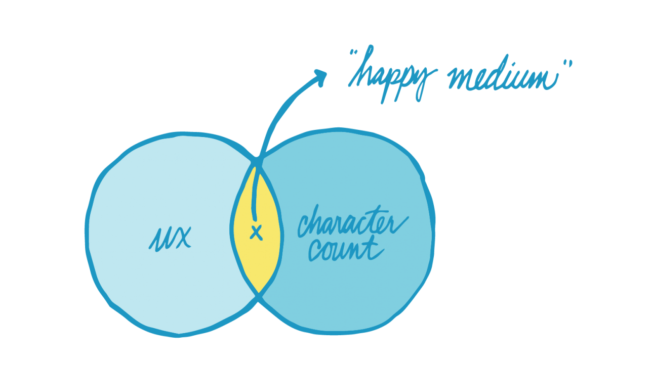
With content, and especially text, we have to walk a fine line between getting our message out there, communicating everything we want to say, and not overloading our subscribers with content. We want to make sure that your marketing emails aren’t so long that they’ll lose readers’ interest but not so short that they feel like it wasn’t worth their time to open it. How do we balance optimal character count based on UX research with having enough content to spell out that super-long, multi-tiered promo or to convey our brand in just the right way?
And which strategy is better? Sticking strictly to recommended character counts or busting out of the confines to say everything you want to say? As with so much of email, it depends. You need to find a balance and strategy that works for your audience. That said, we’ve put together some guidelines to give to a place to start creating your company’s email content best practices as it concerns length and character count.
Subject lines & preheaders
Since subscribers only spend about 3–4 seconds determining whether or not they’re going to open your email, you need to grab their attention and interest immediately. That means you have to write for your subscribers. Your subscribers, aka “users,” want to share, interact and engage with your email content. If they didn’t, they wouldn’t have subscribed to your emails, right? Make sure you give them plenty of reasons not to unsubscribe or send you straight to their junk mail.
We’ve written before about character count, subject lines and preheaders for mobile devices. You can read about that in this helpful chart that gives you specific numbers for different email clients. Generally, you have about 40 characters for subject lines and 100 characters for preheaders. That doesn’t mean you need to use all of those characters. Short, punchy subject lines can be very effective.
Body copy
We read recently that the average email user spends an average of 51 seconds reading each email they get, so know that you don’t have much time to get your message across. Keep it under 750 words broken up into short blocks of text containing 100–200 words. Use headlines, subheads and bullets to make the copy scannable. You can effectively divide big blocks of text with images, too.
You’ll also want to keep your email copy within a certain width. Having the right amount of characters on each line is key to readability. If your lines are too wide, readers will have a hard time focusing on the text. If they’re too short, it tends to add stress to the reading experience. According to typographical research, the optimal number of characters per line is around 55 to 75.
Choosing the right email design approach for your subscribers is key to delivering usable, useful content. You can choose from responsive, fluid and scalable/aware design depending on your audience and how many of them are opening your emails on mobile devices. You should also consider your business goals and available resources when making design choices. Mobile copy should be in a single column. You have more flexibility with your email design for desktop. We’ve seen plenty of multi-column layouts do well there.
Are a lot of your subscribers opening your emails in Gmail? If so, know that Gmail has a 102KB email size limit—just the HTML, not including images. Emails that go over 102kb will be clipped, cutting off the bottom of the message.
In addition, whitespace is key to creating a great user experience. It gives your readers’ eyes time to rest. And it’s been shown to increase users’ comprehension.
CTAs
Make your email actionable in any environment—mobile, webmail and desktop. Character count for your CTAs depends on your touch targets. Apple recommends making touch targets at least 44 pixels square. You want to make your calls to action big enough for large thumbs to tap easily.
Find the Sweet Spot with A/B Testing.
As we hinted earlier, all of the above depends largely on your target audience. Test, test and test again to learn what works best for them. You can A/B test character counts for subject lines, preheaders, CTAs and body copy; whitespace in relation to copy; using images to break up text; overall email length; copy width; and more.
The subscriber journey doesn’t begin and end with your email. Once you get a subscriber to interact with your email, you need to make sure you follow through with the promise of your CTA by providing value with your landing page. Do everything you can to make your buyer’s journey a pleasant one from first contact to conversion to advocacy.
Get in touch with Filament to learn how to give your customers a great experience from start to finish.


Comment (1)